How to Read a Latency Histogram Without Fooling Yourself
Read latency histograms by checking buckets, tails, multiple modes, aggregation, sample counts, and the workload behind every shape.
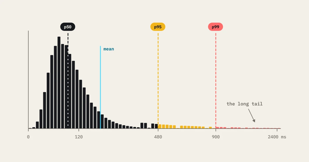
A latency histogram shows how observations spread across ranges. It can reveal a tail, a second mode, or a saturation cliff that a single percentile hides. It can also mislead you when buckets are too broad, samples are blended, or the chart leaves out the workload.
Start with the axes and units
Read the x-axis unit and the bucket boundaries. A bucket from 0 to 1 second hides the difference between 10 ms and 990 ms. Read the y-axis as count or frequency and check the total sample count. A tall bar can mean a large volume, or a small sample drawn on a convenient scale.
Confirm which timing the chart measures: client round trip, server processing, queue wait, or browser navigation. A histogram means something only when its boundary is clear. Put status and operation labels next to it.
Recognize common shapes
A compact peak points to a narrow cluster, though it says nothing about correctness. A long right tail marks a slower cohort. Two peaks can come from cache hits and misses, different journeys, regions, or a dependency path. A sudden cliff can mean a timeout bucket, a rate limit, or a resource ceiling.
Do not name a cause from shape alone. Test the hypothesis with target telemetry and a controlled experiment. A second mode that shows up for one payload only may point to data shape. The same mode across every operation may point to a shared network or generator boundary.
Percentiles come from the distribution
The median is the point where half the observations are faster and half slower. p95 and p99 describe the slow edge. They do not tell you whether the tail is one smooth slope or a separate population. Read the histogram beside the percentiles. The latency percentiles guide explains why these summaries need context.
Never average p95 values from workers as if the result were global. Merge counts, or use an aggregation method that keeps the distribution. A worker serving mostly cache hits can have a better p95 than one serving writes, so the combined result needs sample weighting.
Inspect time windows
Compare histograms for warm-up, steady state, each ramp step, and recovery. One all-run histogram can hide the moment a queue started to grow. Overlay matching windows across runs only when load, environment, cache state, and data are comparable.
Look for movement, not one dramatic bar. A tail that appears after each arrival-rate step tells you more than a tail that appears once during an unlabelled deployment event.
Segment the population
Split by journey, route, method, status, payload, region, cache state, and assertion result where you can. A blended histogram can look smooth because fast reads drown out a failing write. Segmenting may show that the business-critical path has a very different shape.
Keep invalid samples visible. A timeout, a client error, and a failed business assertion must not vanish from a “successful latency” chart. Show counts for each class and state whether retries add observations.
Check the generator
The client can create its own tail through CPU, garbage collection, socket limits, bandwidth, DNS, or event-loop delay. Compare generator health with the target’s signals. If every worker sees the same target delay, suspect the target. If one worker alone has a tail, look at its placement or client resources.
Verify the achieved workload. If the scheduler stalled, a histogram of 1,000 requests says nothing about a requested 100,000-arrival scenario. Record scheduled, achieved, dropped, and retried work beside the chart.
A useful review sequence
- Confirm boundary, unit, buckets, sample count, and status.
- Read shape and percentiles together.
- Split by operation and time window.
- Compare target and generator telemetry.
- Test the leading cause with a controlled change.
Keep labeled results and comparisons in a governed store. Let the histogram pose the question, then answer it with workload and system evidence. A pretty distribution is not a diagnosis.
Bucket choice can change the story
If every bucket spans a full second, a tail at 1.01 seconds looks the same as one at 1.99 seconds. Pick boundaries that match the objective and keep detail near the threshold. Keep an overflow bucket for values past the display range, and report its count instead of clipping it. A chart that cuts off timeouts misleads its reader.
For a hypothetical search objective of 800 ms, use finer buckets around that boundary and label the timing window. Compare warm and cold runs separately. If the second mode disappears once the cache is prepared, the hypothesis gets stronger. If it stays across cache states, inspect another shared dependency. The histogram guides the experiment, and the labels keep it honest.
When you share a chart in a review, put the scenario name, load step, timing boundary, total samples, and overflow count in the caption. A cropped screenshot without those facts invites a false comparison. Keep the underlying distribution for later aggregation, and never claim a smoothed visualization shows the raw tail.
Aggregate without losing meaning
Aggregation is where a useful histogram turns into a misleading report. Never average percentiles from separate workers or time windows and call the result a global percentile. Percentile math needs the underlying observations or a mergeable distribution summary. If only per-worker summaries survive, say the comparison is approximate and keep that limit visible. A weighted mean can describe central tendency. It cannot rebuild the tail.
Match the aggregation boundary to the decision. A release gate may need one distribution for a named business journey. An operator chasing a dependency needs route, worker, and downstream labels. Keep a global view for impact and a segmented view for diagnosis. If one tenant, region, or status class dominates the total, show that segment on its own so it does not disappear inside a pooled chart.
Treat time as data. Compare steady-state windows separately from warm-up, ramp, recovery, and deployment transitions. If a run includes a cache reset or an autoscaler event, annotate the histogram or split it into windows. A distribution that mixes cold start and steady state can be mathematically correct and still useless for deciding whether the service is ready after the ramp.
Check the measurement path before you read code. Confirm clocks use the same unit, timers start and stop at the intended boundary, failed requests are counted, and sampling does not skip slow responses more often than fast ones. A dashboard that drops timeouts shows a healthier tail exactly when the system is failing. As a sanity check, compare a small raw sample with the rendered buckets.
When a tail shifts, change one thing at a time. Hold workload and fixture constant while you change cache state, dependency latency, pool limits, or worker count. Predict which bucket or segment should move before you rerun. If the prediction fails, keep the result as evidence against the hypothesis. Store the bucket configuration, counts, overflow, release, and load step with the result so another reviewer can reproduce both the view and the conclusion.
Take a concrete review: two runs with the same median but different upper buckets. First check whether the slow samples belong to the same journey and status class. Then compare achieved arrivals and queue age. A stable median with a growing tail often means a subset started waiting behind a shared resource. Next, inspect dependency timing and worker saturation. Change application code or a threshold only after those checks. Writing down that order turns the histogram into a falsifiable investigation instead of a visual reaction.